
The graphs below provide information on global population figures and figures for urban populations in different world regions. Summarise the information by selecting and reporting the main features, and make comparisons where relevant.
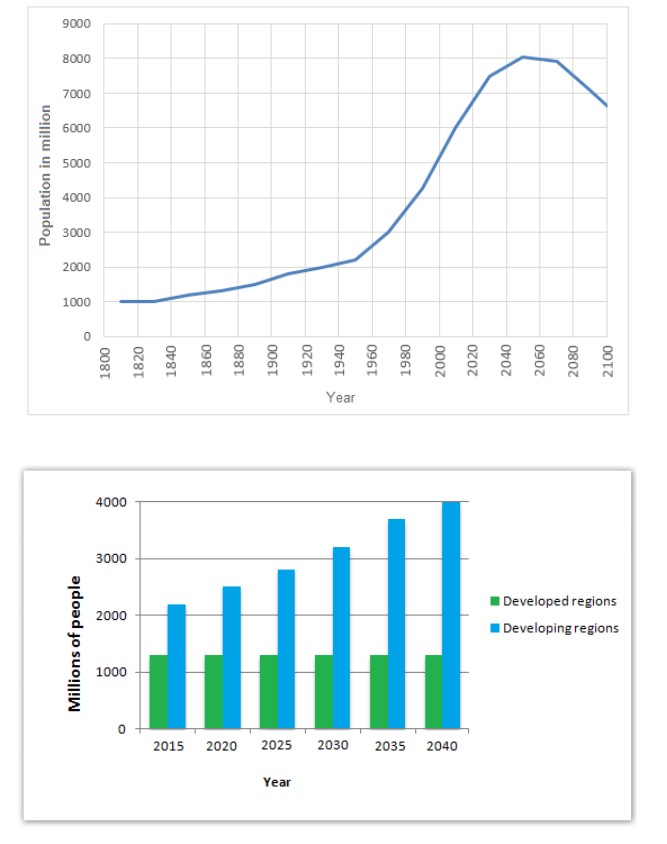 The two graphs illustrate the population rate among two distinct world areas, thus global and urban, and they are expressed in figures.
Overall, there is a clear clue that there are fluctuations in the population recorded globally, whereas there is a significant increase in population in the developing regions. Surprisingly, data of developed areas were recorded, but it had no changes over the years.
According to the first graph, the global population experienced a slight increment from 1000 million in the year 1800 to roughly 2000 million in the year 1950 and shot up to 8000 million from 2050 and 2070.
In terms of the urban population, 2015 had recorded figures slightly above 2000 and significantly increasing every 15years but recorded 4000 million people in 2040 as the highest population.
Follow Us on Facebook