 (1)")
The chart below shows the percentage of young people in higher education in four different countries in 2000, 2005 and 2010. summarise the information by selecting and reporting the main features and make comparisons where relevant.
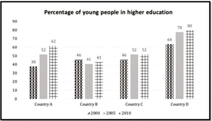
The bar chart illustrates information about adolescents’ master study education in four different nations (Country A, B, C &D) between the years 2000 to 2010. It is readily apparent from a given graph that higher education of young people is measured in percentage (%) for a given period.
It is conspicuous from the provided graph that interest for master study increased for a given year among the youth in country D. On the other hand, young people have less attentiveness in the year 2000 for country A while the same trend is depicted in country B for the years 2005 & 2010.
Explicitly, in the year 2000, young students were pursuing their higher study in country D with 64%. Alternatively, they were in a dip position in country B (38%). Besides that, there were stable data observed for countries B & C, which was 46%. Turning to 2005, there were so many fluctuations perceived from the chart. Country D has almost doubled young candidates compared to country B, where youngsters in countries A and C were defined as constant who joined masters degree.
On further scrutiny, country B has been falling down instead of country A as almost half of young students carried out the higher study in 2010. Lastly, countries A and C have a marginal difference of 10% for the year 2010.
Follow Us on Facebook
Also Read The Charts Below Show the Figure for Hours of Work per Week