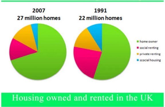
The pie charts below show the percentage of housing owned and rented in the UK in 1991 and 2007. Summarize the information by describing the main features of the charts and making comparisons where appropriate.
The pie charts illustrate homeownership and renting in the U.k in 1991 and 2007 in terms of percentage.
In 1991, homeowners were the most popular type of housing, which was approximately 60%. The next largest sector was social rented homes, which accounted for one-fourth of homes. The remaining homes were private renting and social housing, which consisted roughly 10% and 5%, respectively.
In 2007, the number of the homeowner had risen to almost three-quarters of all homes; however, the percentage of social rented homes showed a downward trend, which decreased from 23% to 17%. The proportion of private renting homes had remained unchanged. At the same time, there were 5 million more homes in 2007 compared to 1991. The number of social housing has dropped three-fold in 2007. And it remains the least popular type of housing.
Overall, it can be seen that homeowner is one of the most popular types of housing, while social housing is the least popular type of housing throughout the given years.
Follow Us on Facebook


