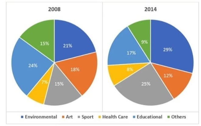
The chart below shows the percentage of volunteers by organizations in 2008 and 2014. Summarize the information by selecting and reporting the main features, and make comparisons where relevant.
 Sample answer of The Chart Below Shows the Percentage of Volunteers by Organizations in 2008 and 2014.
The two pie charts illustrate the proportion of volunteers by the companies in 2008 and 2014.
Overall, there are 6 types of volunteers in organisations. However, the ratio of participants varies from 2008 to 2014.
From a quick glance at the pie chart, it is clearly seen that there were changes in volunteers from 2008 to 2014. In 2008, the environmental voluntary proportion was 21%; however, in 2014, it was increased by 8% that is 29%. The second type was 8 as it was more in 2008 that is 18% and in 2014 it was only 12 %. Type is sports as there was an aspectual increase from 2008 to 2014 of 10% that is 15% and 25% respectively. After that, Health Care is another category of volunteer, and in this, there was not such a dramatic change as it was 7% in 2008 and only 1% was increased in 2014. Another class is educational as there was a decline AAP 7% from 2008(24%) to 2014(17%). The last type is others who were 15 people in 2008 and 9% in 2014.
Follow Us on Facebook
Also, Read The Chart Below Shows the Places Visited by Different People Living in Canada.


