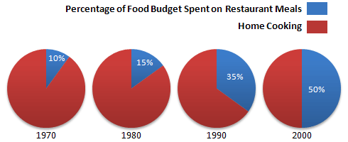
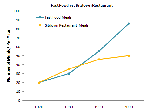
The charts below show the percentage of their food budget the average family spent on restaurant meals in different years. The graph shows the number of meals eaten in fast-food restaurants and sit-down restaurants. Give reasons for your answer and include any relevant examples from your own knowledge or experience.
Presented pie charts compare the proportion of food budget invested in restaurant meals and home cooking food, while the line graph delineates the food consumed in the junk food and the sit-down restaurant over the three decades.
Overall, by the year 2000, the largest proportion of the food budget was invested in a restaurant meal. They invested half of the total budget, whereas, in the line graph, junk food meals escalated significantly over the three decades. Looking at the pie charts, the investment in the food budget in restaurant meals exacerbated remarkably in the span of 3 decades.
Initially, in 1970, it commenced with 10%, and by the year 2000, it enhanced with half of the total budget. Turning to the line graph, junk food meals embarked with 20 meals per year. However, in the subsequent years, it displayed considerable growth. By the year 1980, it climbed with 10 number of meals per years. But after onwards, the trend skyrocketed in the following years. Finally, in the year 2000, it reached at 90 number of meals per year which was twice than the previous year.
In the case of sit down restaurant meals, the trend was started with 20 meals per year, and it exacerbated in successive years. By the year 2000, sit down restaurant meals were held at a difference of nearly 30 meals per year.
Follow Us on Facebook
Also Read Handwriting Speaking part 1 Questions With Answers


