The graph below shows the Gross Domestic Products (GDP) in four selected countries between 2010 and 2015. Summarize the information by selecting and reporting the main features, and make comparisons where relevant.
 Sample Answer of The Graph Below Shows the Gross Domestic Products (GDP) In Four Selected Countries Between 2010 and 2015
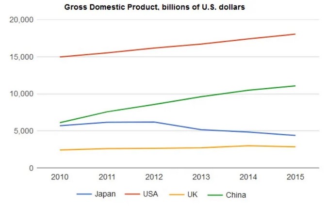
The Graph below shows the Gross domestic product (GDP) of four different nations between the years 2010 to 2015. Overall USA has the highest GDP in Five years.
In 2010 USA stayed on the top of the list with a GDP of 15000 billion dollars. While Japan and China have roughly around 6000 billion dollars. Moreover, the UK was at 2.5k billon dollars, which was the lowest in 2010.
In 2015 the USA remained on the top of the list and also rose from 15000 to 19000 billons dollars. However, China took over Japan and China’s GDP at around 11000 billion dollars, and japan was almost at 4000 billion dollars, and the UK was still at the same place while they were in 2010.
Follow Us on Facebook
The Diagram Below Shows how Salt Is Removed from Seawater to Make It Drinkable